Optimizing the Checkout Flow
Overview
Summary:
This project aimed to overhaul Obilet's one-page checkout process to address significant usability issues that made the experience frustrating and unpleasant for users. The redesign focused on simplifying the checkout funnel, reorganizing the layout, and improving payment options to create a more intuitive and seamless experience. As a result, the new design led to improved user satisfaction and stronger business metrics.
My Role:
As the lead UX designer, I collaborated closely with cross-functional teams, including product managers, developers, and business stakeholders. My primary responsibility was leading the design process from ideation to implementation, ensuring that user experience improvements addressed usability pain points while working within technical constraints.
Defining the problem
Challenge:
The checkout page had a cluttered layout, confusing payment options, and a disjointed flow that frustrated users and led to negative feedback, despite them completing their transactions. These issues made the checkout process inefficient and unpleasant, affecting overall user satisfaction and hurting business performance.
Impact:
Addressing the poor user experience was critical for enhancing both customer satisfaction and business results. The confusing design created friction during checkout, making it a frustrating experience. By optimizing the process, the goal was to streamline the journey, boost user satisfaction, and ultimately improve business metrics like conversion rates.
Client
Obilet
Year
2024
Understanding the user
#userdata #interview #heuristicreview
Based on a heuristic review and direct user feedback, several key issues have been identified in the checkout process. Below is a summary of these issues, the corresponding usability heuristics violated, and their impacts on users:
Distractions in the Header
Heuristic Violated: Recognition rather than recall
Impact on Users: Non-essential links distract users during checkout, leading to unintended navigation away from the funnel. Users expressed frustration at losing focus, causing them to abandon the purchase.
Absence of Crucial Information on the Page
Heuristic Violated: Help and documentation
Impact on Users: Users struggle to find critical information (e.g., price details, currency converter), leading to uncertainty and premature exits from the process.
Disorganized Three-Column Layout
Heuristic Violated: Aesthetic and minimalist design
Impact on Users: A cluttered layout with information in an illogical sequence confuses users, causing decision fatigue and disrupting the checkout flow.
Disappearance of CTA Button During Scroll
Heuristic Violated: Visibility of system status
Impact on Users: When the "Complete Purchase" button disappears as users scroll, it increases cognitive load and irritates users, significantly disrupting the checkout flow.
Inadequately Displayed Payment Options
Heuristic Violated: Visibility of system status
Impact on Users: Hiding preferred installment payment options behind a dropdown limits discoverability, causing unnecessary friction and reducing users' ability to choose suitable payment methods.
Excessive Requirement of Personal Information
Heuristic Violated: User control and freedom
Impact on Users: Requiring excessive personal information feels invasive, adding interaction costs and leading to higher abandonment rates as users seek a more streamlined experience.
Upsell Popup Interrupting Purchase Completion
Heuristic Violated: Consistency and standards
Impact on Users: The appearance of an upsell popup after clicking "Complete Purchase" breaks user expectations, leading to frustration and increased abandonment rates due to the desire for a smoother process.
Exploring Solutions
#competitoranalysis #benchmarking
Here are benchmarks of competitors and and how I used them to inform my design:
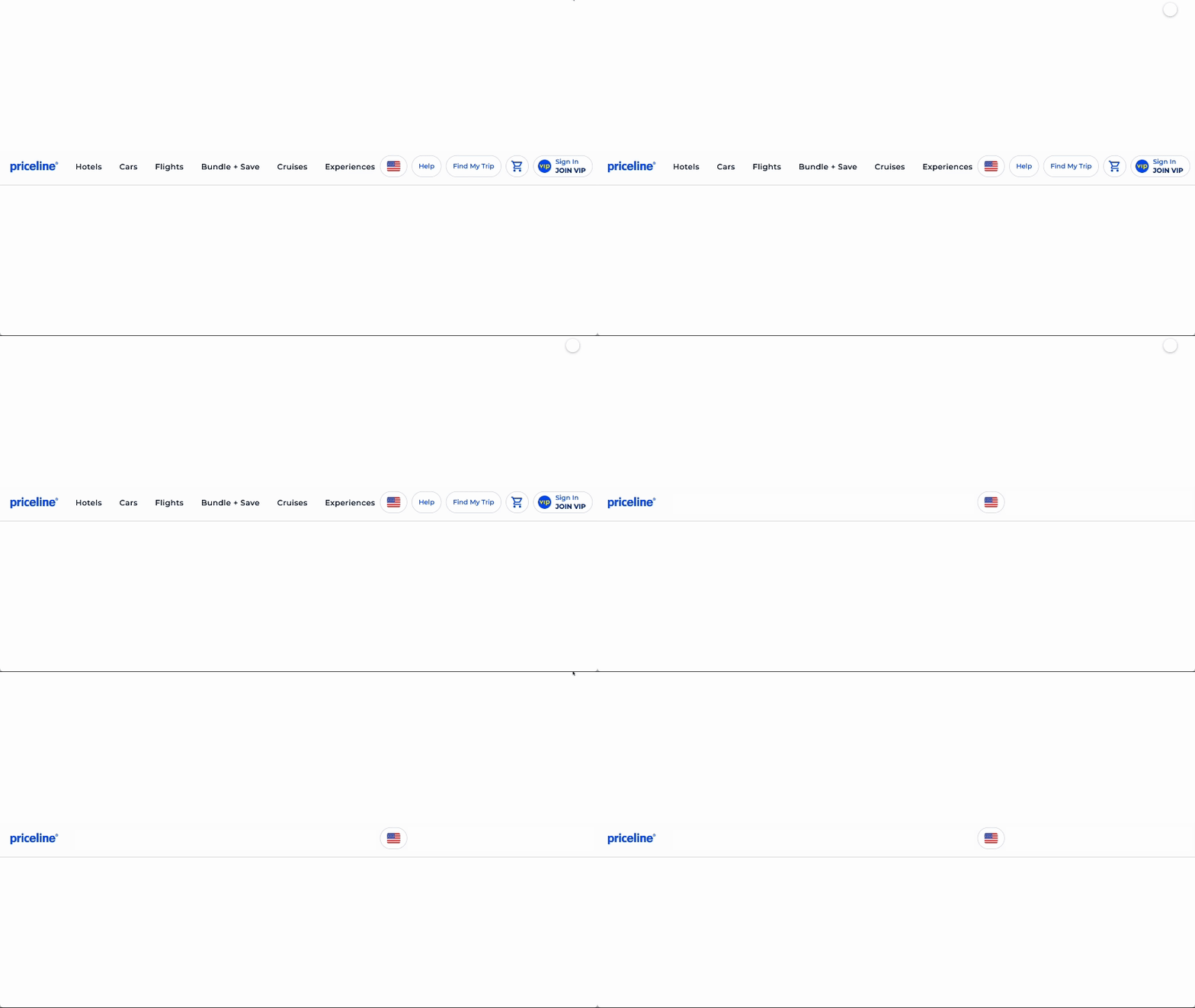
Priceline checkout helps user focus
Need: Reduce visual clutter to maintain focus.
Feat: Header hides all distractions
Airbnb checkout offers multicurrency access
Need: Ensure key information is within reach
Feat: Footer allows users to change currency
Expedia makes necessary info easy to follow
Need: Improve hierarchy by simplifying layout
Feat: 2-column layout with sticky price summary
Wingie shows card-specific payment options
Need: Let user view her payment options only
Feat: Progressive disclosure in card field info
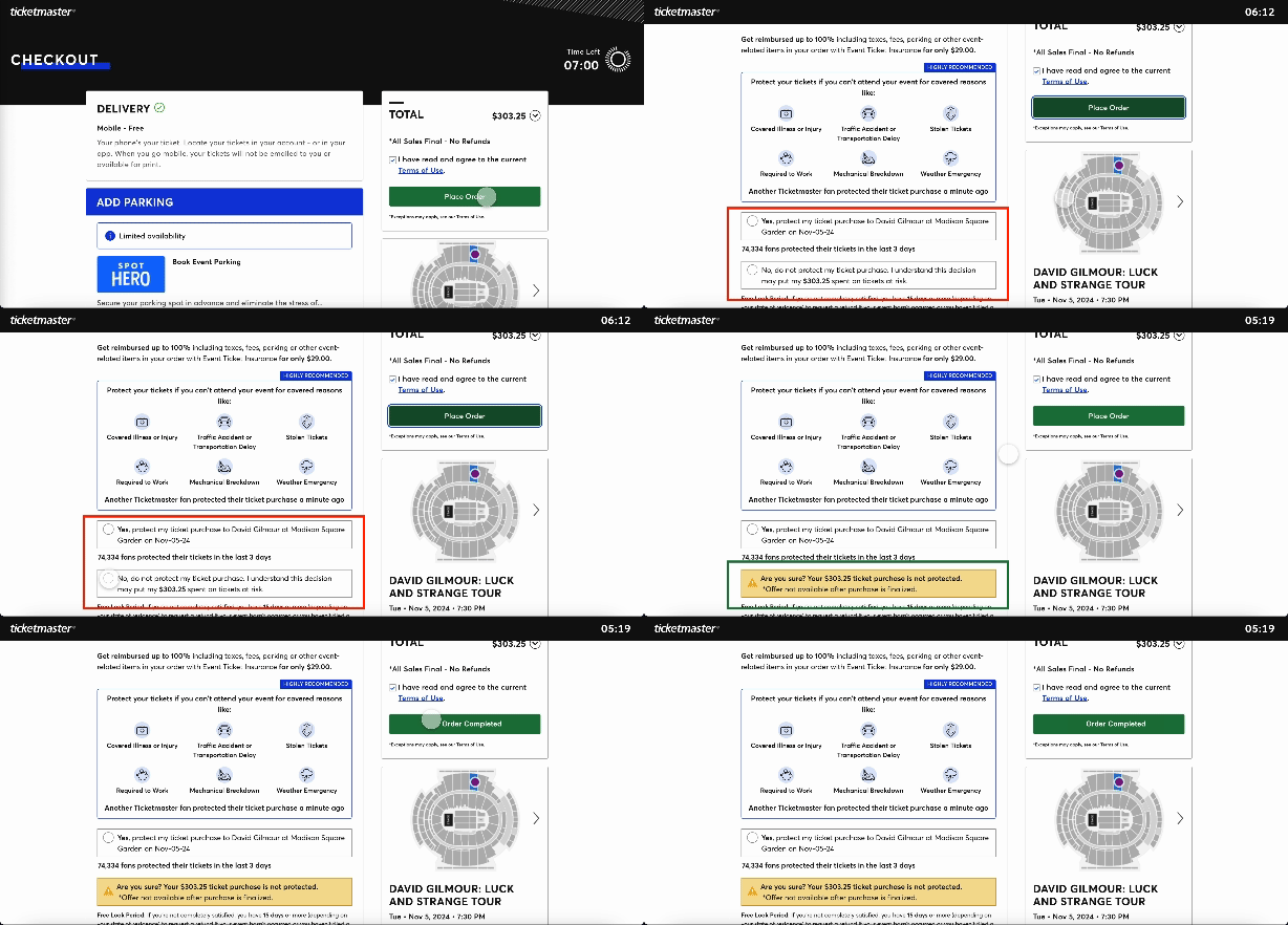
Ticketmaster ensures no add-on is missed
Need: Find way to avoid purchase interruption
Feat: Show add-ons w/o blocking purchase
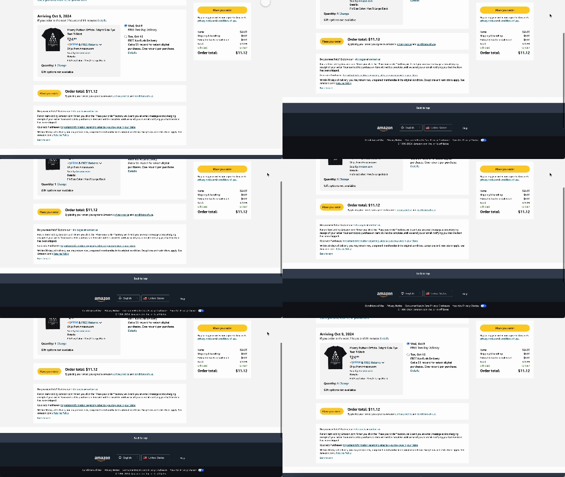
Amazon keeps CTA button visible at all times
Need: Buy button has to be within eyesight
Feat: CTA button has fixed position in scroll
Booking avoids non-obligatory user input
Need: Minimize user input for faster checkout
Feat: 0 redundancy in form field requirements
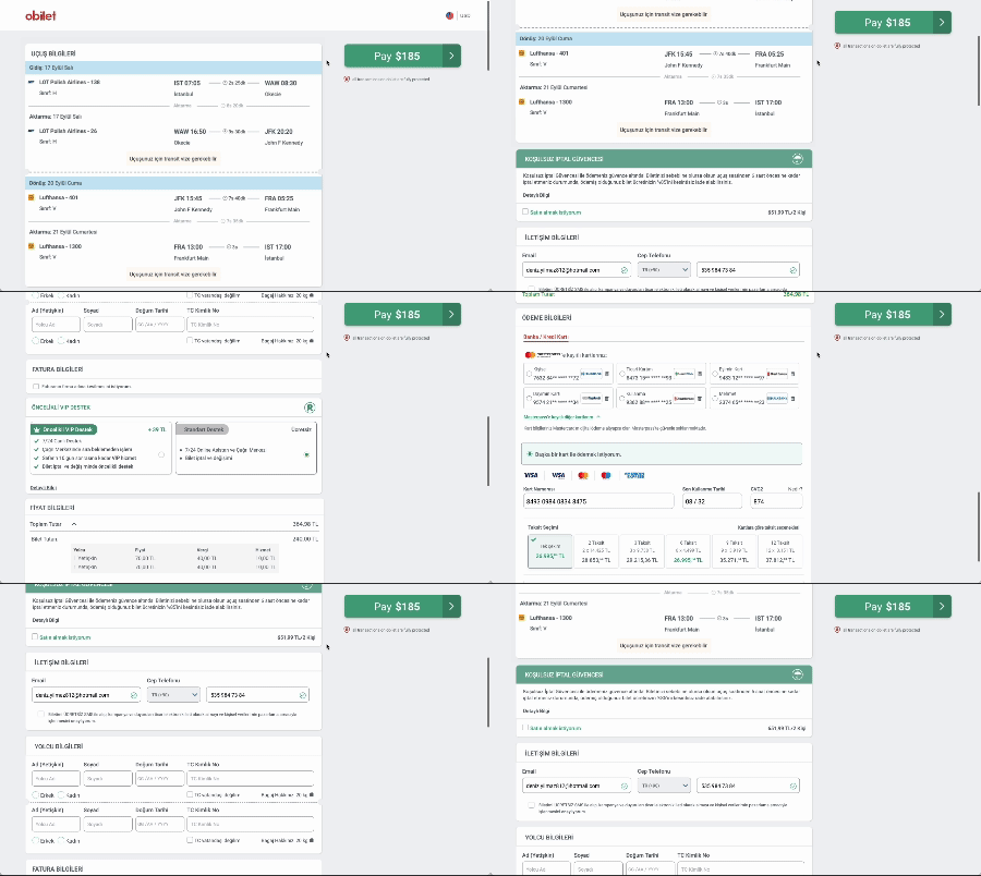
Obilet redesign
Goal: A patchwork blending the outcomes of these benchmarks to craft a mosaic of exceptional UX
Design Process Part 1: Mobile
#mobilefirst #informationarchitecture #gestaltprinciples #navigationalhierarchy #prototyping
Mobile-first
Recognizing that a significant portion of our users accessed the platform via mobile devices, I prioritized Wroblewski’s mobile-first design principles. This approach ensured the checkout experience was optimized for smaller screens before scaling to desktop.
To tackle common mobile challenges like smaller touch targets and slow load times, I focused on creating a seamless, intuitive checkout. The redesign emphasized clarity, speed, and usability by reducing visual clutter, optimizing CTAs for thumb-friendliness, and streamlining steps—delivering a frictionless experience aligned with modern user expectations.
Designing for mobile posed unique challenges, such as optimizing for limited screen space, ensuring touch-target usability, and maintaining readability. Every element had to justify its presence, requiring careful prioritization of essential information.
Buttons and interactive elements were resized and spaced to meet touch target guidelines, preventing accidental taps.
Readability was enhanced by selecting legible font sizes and balancing text density with white space.
These constraints demanded precise design decisions to create an intuitive experience that feels uncluttered, functional, and user-friendly, even on smaller screens.
Challenges:
Usability Improvements:
1) Collapsing Unnecessary Steps
Streamlined multi-step processes into fewer sections,
reducing effort and improving flow on small screens.
2) Optimizing Tap-Friendly CTAs
Used green to leverage color psychology, minimized wording,
and improved spacing to prevent accidental taps.
Before
After
3) Leveraging Visual Hierarchy
Grouped related objects, added placeholders for guidance,
and implemented symmetry to minimize users’ cognitive load.
After
Before
4) Adapting Navigation
Replaced wide menus with compact dropdowns
or accordion elements suitable for vertical scrolling.
Before
After
After
Before
5) Addressing Screen Clutter
Minimized visual overload by reducing content density
and emphasizing essential elements.
Before
After
6) Personalizing Contextual Experiences
Tailor content and actions to users' recent and frequent
preferences for a more intuitive, relevant mobile journey.
Before
After
Design Process Part 2: Desktop
#informationarchitecture #gestaltprinciples #navigationalhierarchy #prototyping
Simplifying navigation, merging steps , prioritizing content…
Here is how I focused on improving the user experience for the desktop.
1) Simplifying Checkout Header
Streamlined the checkout process by reducing unnecessary steps and making navigation intuitive to improve user flow
Before
After
-
Totally unnecessary.
A checkout header should be non-distracting and concise to minimize cognitive load, keeping users focused on completing their purchase without unnecessary distractions or confusion. It ensures clarity, reinforces the user's progress, and reduces the risk of drop-off due to overwhelming or irrelevant information.
-
Definitely not.
Including these can distract users from the primary goal of completing their purchase. Instead, the checkout header should focus on guiding users through the process with clear steps, essential information, and minimal distractions.
-
Definitely necessary feature.
A multicurrency feature in checkout enhances user convenience and clarity by displaying prices in their preferred currency, reducing confusion and potential conversion concerns.
Questions that led to redesign
2) Emphasizing Price Details
Redesigned, repositioned and expanded price information to enhance clarity, build trust, and help users make faster decisions.
Before
After
Questions that led to redesign
-
Very hard to find, unfortunately.
If price details are hard to find during checkout, it can frustrate users, lead to mistrust, and increase the likelihood of cart abandonment, as transparency about costs is critical for building confidence in the purchase process.
-
Valid points.
It’s generally better to keep the price details menu expanded and visible during checkout to ensure transparency and make it easy for users to review costs without additional clicks. Collapsing it may create friction or mistrust, as users could feel uncertain about hidden fees or totals.
3) Transforming Page Layout
Restructured the page layout to improve visual hierarchy, making content easier to scan and interact with.
Before
After
Questions that led to redesign
-
If a user feels lost on the page, it leads to frustration, increased cognitive load, and a higher likelihood of abandoning the purchase, as they struggle to find their way or complete their goal efficiently.
-
Making the Pay button sticky ensures users can quickly complete their purchase without scrolling, reducing friction and keeping the primary action always accessible, which improves usability and boosts conversion rates.
-
User may forget major points about the trip details.
A sticky, condensed trip summary improves usability by maintaining context, reducing interaction cost, and enhancing the user's cognitive flow during the checkout process.
4) Customizing Installment Options
Tailored installment options with user-friendly displays to align with user needs and purchasing behavior.
Before
After
Questions that led to redesign
-
Showing non-contextual data, like unrelated installment campaigns, overwhelms the user with unnecessary information, increases cognitive load, and distracts from the task at hand, leading to confusion, and frustration at this step of the process.
-
Minimizing interaction cost by displaying information directly on the page rather than using a popup enhances efficiency, reduces friction, and keeps the user focused on the task, leading to a smoother, more intuitive experience with fewer chances for interruption or confusion.
5) Minimizing Form Fields
Reduced form complexity by removing redundant fields, minimizing friction, and accelerating task completion.
Before
After
Questions that led to redesign
-
If a form field is not required, eliminating it reduces the user's cognitive burden, streamlines the interaction flow, and minimizes unnecessary data entry, ultimately enhancing efficiency and simplifying the user journey.
-
Requesting information that the user cannot provide creates friction and disrupts the experience, leading to frustration and unnecessary barriers. It is essential to align input fields with the user's context to maintain a seamless, relevant interaction.
6) Reorganizing Upsell Placement
Optimized upsell placement to be less intrusive while maintaining visibility and enhancing conversion opportunities.
Before
After
Questions that led to redesign
-
The user is forced an additional decision that is not contextually relevant at that stage in the process.
Introducing a blocker popup interrupts the user's momentum, adds unnecessary steps, and creates potential uncertainty, making it more likely that they will abandon the transaction.
-
A vague prompt at the final payment stage can lead to hesitation, creating uncertainty and preventing the user from feeling confident in completing their purchase, which may ultimately result in dissatisfaction or abandonment of the transaction.
-
We have to understand the user’s concern. Reevaluating the popup's purpose and its impact on the order is essential to ensure users feel confident and avoid any confusion during the checkout process.
OLD DESIGN
REDESIGN (1st ITERATION)
Testing & Validation
#A/Btesting #usertesting #prototyping #heatmaps
The redesigned checkout page went through a series of iterations first. Then it was validated through A/B testing by rolling it out to 10% of users and comparing their behavior with the control group.
The observed improvements in user engagement and task completion rates convinced stakeholders to adopt the new design for all users. This approach ensured real-world validation, allowing us to measure the design's impact in a live environment and gather actionable insights directly from user behavior.
Based on these insights, I made targeted tweaks to further optimize the design before its full rollout. Stakeholders were thrilled with the outcome, as conversion rates soared following the implementation of the new design.
1. Streamlining Price Details (implemented after iterations)
Before: The price breakdown was collapsed, requiring users to expand it to view details.
Iteration: After observing that users hesitated to confirm their purchase, I updated the design to keep the price details expanded by default, ensuring transparency and reducing second-guessing.
Insight: Although Price Details were expanded, some still had trouble finding it on the page. Besides, my competitor analysis revealed that Price Details and Pay button are generally in close proximity.
Iteration 2: I kept the price details expanded, moved it above Pay button, and made it sticky.
Result: .Price Details and Pay button are related, thus, placing them in close proximity helped organize content and streamline this section.
2. Sticky Call-to-Action Button (approved)
Before: The "Pay Now" button was only visible at the bottom of the page, forcing users to scroll.
Iteration: After noticing a drop in conversions among users with long forms, I made the button sticky so it was always accessible.
Result: It simplified the experience and boosted task completion.
3. Condensed Trip Summary (did not work out)
Before: The trip summary was lengthy and required users to scroll back to review.
Iteration 1: Based on feedback indicating user confusion, I shortened the summary and implemented a sticky version to maintain context while users filled out the form, minimizing navigation friction.
Insight: Some users found the sticky trip summary distracting when filling out detailed forms.
Iteration 2: I modified the sticky summary to collapse slightly as users typed but expand when they scrolled up, maintaining context without overwhelming the screen.
Insight: Some users felt the need to scroll up to see the full trip summary instead of the summarized sticky version to make sure they thoroughly checked the trip details.
Result: I removed the sticky summary entirely from both the desktop and mobile versions.
Reminder: We may think we are helping the user out, however how they perceive and interact with our product may be entirely different than what we imagined. No two users have the exact same mental model.
4. Reducing Non-Essential Fields (worked great!)
Before: We used to have so many required form fields compared to our competitors that, after checking heat map data, we feared some users may have abandoned the checkout because they felt overwhelmed.
Iteration: I removed unnecessary fields, clarified optional ones, and simplified the form structure, resulting in a more focused and efficient user experience.
Result: We had significant boost in our conversion rates.
5. Contextual Upsell Presentation (we met halfway)
Before: In order to increase upsell profits, an aggressive approach had been forced upon the team: Upsell offers should appear as a blocker popup after the payment button is clicked, disrupting the whole checkout experience. Besides, an unexpected popup at this stage caused users to wonder if closing them would cancel their order, which eventually led to confusion and delays.
Iteration: I suggested a redesign where the upsell offers are introduced to the user before the checkout page, at an earlier phase popup. Any upsell selected at this popup would no longer be displayed on the checkout page, while any unselected upsell would still be added as a non-intrusive offer in checkout.
Result: Redesigned version might still be considered pushy to some. However it’s fair to say that, by reducing friction at the payment stage while still keeping the offers, we managed to avoid disrupting the checkout flow.
6. Refining Multicurrency Display (implemented after iterations)
Before: Users did not have the option to change currency in checkout
Iteration 1: I added the option on the footer where it wouldn’t distract the user unless they are looking for it. My concern was that placing it on a prominent place would force the user to pay attention to it regardless of their need.
Insight: Internal feedback was that (1) some users may have difficulty finding the multicurrency toggle and (2) the currency option was buried in a dropdown which might not be intuitive. I decided to find a more accessible location, however, since the dropdown is the universal norm in currency and language toggles, I decided to keep its form as is.
Iteration 2: I surfaced the multicurrency toggle in the header, a more accessible location and clearly highlighted the default currency, making the feature more usable for international customers. I also added a subtle confirmation banner at the top of the page to remind users of their selected currency, ensuring clarity throughout the checkout process.
Result: The currency toggle was implemented to the header not only in checkout header but all pages, helping the user by maintaining consistency throughout the site.
7. Refining Error Messages for Payment Fields (approved)
Insight: Live testing revealed that users were confused by generic error messages when entering invalid credit card details.
Iteration: I updated the error messages to provide specific, actionable guidance (e.g., "Please check the card number for typos"), reducing user frustration and improving form completion rates.
8. Fine-Tuning the Call-to-Action Design (approved)
Insight: A/B tests showed that users hesitated slightly before clicking the sticky Pay button, potentially due to lack of emphasis.
Iteration: I updated the button’s color and size for better visual prominence and added a subtle animation to draw attention, increasing click-through rates.
9. Simplifying Upsell Presentation (not approved by stakeholders)
Insight: Analytics revealed that users felt overwhelmed by too many upsell options, even with improvements to timing.
Iteration: I proposed limiting upsells to 2–3 relevant offers tailored to the user's trip details, displayed in a collapsible section for easier navigation. This would reduce cognitive load and improve user focus.
Result: While research supports the benefits of simplifying choices to avoid the paradox of choice, revenue considerations led to maintaining a broader range of upsells for now. The recommendation remains a future opportunity to balance user experience with business goals.
10. Optimizing Load Times for Price Details (improved)
Insight: Some users experienced a delay in price details loading, which caused confusion about the total cost.
Iteration: I worked with the development team to optimize loading speeds for dynamic content, ensuring price breakdowns appeared instantly. I also prepared skeleton loading mockups for checkout screens as a backup.
Result: Quick page response let the users feel in control of the experience, resulting in improved trust and user confidence.
Final Design
OLD DESIGN
REDESIGN (1st ITERATION)
FINAL DESIGN (4th ITERATION)
Key Design Decisions
1) Simplified Layout
To reduce cognitive load, I restructured the checkout process to use a cleaner, single-column layout, eliminating distractions and allowing users to focus on the key tasks without feeling overwhelmed.
2) Sticky CTA Button
I implemented a sticky "Complete Purchase" button, ensuring users always had access to the final step, regardless of where they were on the page, improving visibility and reducing frustration.
3) Payment Options Visibility
By making installment payment options more prominent and eliminating dropdowns, users could easily see their available payment methods, increasing the likelihood of selecting the preferred option.
4) Minimal Data Entry
To enhance user autonomy, I reduced the number of required personal details, focusing only on essential information to avoid user fatigue and improve completion rates.
Team Collaboration
1) Cross-Department Coordination
I worked closely with product managers and developers to ensure alignment on technical constraints while maintaining a strong focus on the user's needs.
2) Stakeholder Involvement
Frequent check-ins with the management team helped ensure the design met business goals and user requirements, enabling smooth iterations and approvals.
3) Collaborative Testing
During the design phase, I collaborated with developers to conduct usability testing and gather real-time feedback, which allowed us to iterate quickly and resolve any potential usability issues early on.
Results & Impact
The redesign successfully streamlined the checkout process, delivering a smoother and more intuitive user experience. By addressing usability challenges, the design enhanced clarity, reduced cognitive load, and simplified the payment journey. These improvements positively impacted key business metrics, including increased conversion rates and reduced cart abandonment.
Key Metrics:
Conversion rate improved to 88%, indicating higher success in completing purchases.
Average time on task reduced by 20%, reflecting a faster and more efficient checkout experience.
Drop-off rate during checkout reduced by 12%, demonstrating a smoother user flow and fewer interruptions.


